
Issue #12: Why every ML engineer should think like a Statistician (part III.)
Understanding statistics isn't desirable, it's crucial
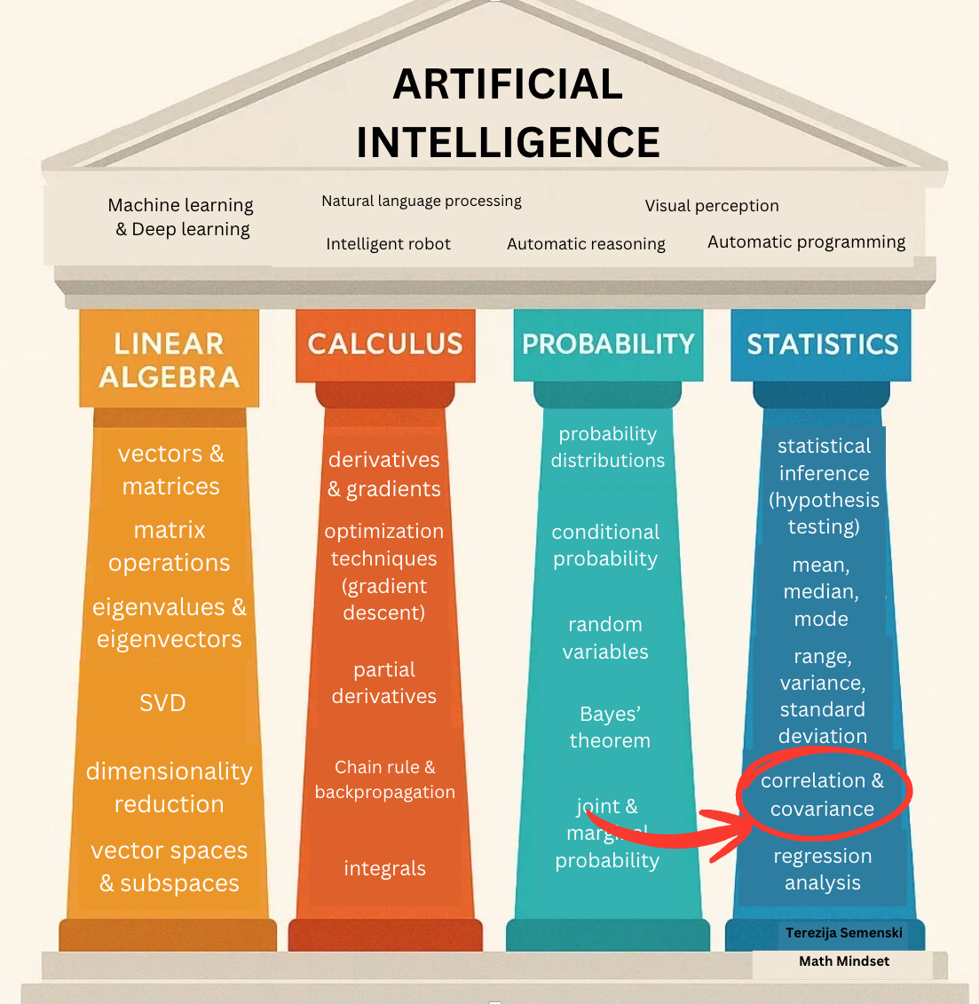
In our last issue, we focused on measures of variability and their importance in ML.
This time, we shift our attention to understanding correlation, covariance, and causation.
In ML, it is essential to understand how variables relate to each other. How is a change in one quantity associated with a change in another quantity?
For example, does sleeping more hours improve overall health? Does studying for more hours tend to improve test results? Does drinking more coffee result in more intellectual tasks being done?
If we discover a relationship, we can use the value of one variable to predict the value of the other variable(s). Recognising such relationships helps us build better models.
Two key concepts for quantifying relationships are correlation and covariance, and their close cousin, the Pearson correlation coefficient (often called the correlation coefficient or just Pearson’s r).
What is correlation?
The marketing department in your company wants to conduct customer segmentation research to identify key customer segments by demographics, behavior, or psychographics. So they ask you to take a look at the data set containing information on 100,000 loyal customers.
You expect a strong relationship between the engagement on social media company sites and the website traffic, since social content drives visits.
Another example would be the time spent on the product page and the conversion rate. Users who spend more time are more likely to buy.
Opposite of that, there is probably a weak or no relationship between customer age vs. email click-through rate (CTR). You could assume that the younger customers click more, but that is often not the case.
The statistical relationship between two variables is referred to as their correlation.
Statistics recognise 3 types of correlation: positive, negative, or neutral.
What is the difference between the 3 types of correlation?
The positive correlation means both variables move in the same direction.
Engagement rate on social media and website traffic is a case of positive correlation.
The negative correlation means that when one variable increases, the other variable decreases.
An example of negative correlation is a customer satisfaction score vs. the number of support tickets. As support ticket volume goes up, their satisfaction score often goes down.
The neutral correlation or zero correlation means that the variables are unrelated, meaning there is no relationship in the change of variables.
In that case, when the value of one variable increases or decreases, then the value of the other variable doesn’t increase or decrease.
An example of neutral correlation is a customer’s favorite color vs. purchase amount. There is no meaningful connection between a customer liking the specific color and how much they spend.
Machine learning relies on correlation during data analysis and modeling.
Sometimes, multiple independent variables in a regression model are highly correlated with each other, a situation known as multicollinearity.
A real-world example of this occurs in e-commerce analytics. Suppose we have a dataset with both total purchase amount and number of items bought, and then we add a new variable for average item price (which is just total purchase divided by item count).
This newly created variable is dependent on the others and introduces redundancy.
Another example: if we include both customer age and year of birth in the same dataset, these variables essentially provide the same information.
Multicollinearity can reduce the performance of certain algorithms. That’s why it’s important to detect and handle it properly.
What is a covariance?
There is a useful statistical measure that helps us understand the relationship between two data samples called covariance.
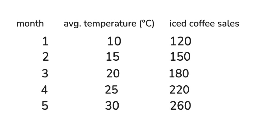
Imagine a coffee shop in New York City.
The owner wants to understand why some months, their sales of iced coffee spike, while in other months, sales drop significantly.
What might be influencing this pattern?
You may guess correctly, it’s the average monthly temperature.
When the weather is hot, people tend to buy more iced coffee.
When it’s cold, sales naturally decline.
Let’s look at a small dataset that records the average temperature (°C) and iced coffee sales for five months:
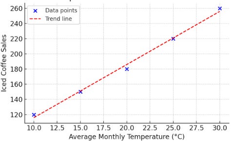
We can represent it using a graph:
Covariance is the measure of the relationship between two random variables.
It can be positive, negative, or zero:
Positive covariance: both variables increase together
Negative covariance: one increases while the other decreases
Zero covariance: no consistent relationship
How do we calculate covariance?
For calculating the covariance, we use these two formulas:
Sample covariance:
Population covariance:
Population vs. sample: what’s the difference?
Population = the entire group you’re studying
Sample = a subset of that group, used to conclude about the whole.
But when we compute measures like variance and standard deviation, it’s important to know whether we’re using a sample or the population, because the formulas differ slightly.
Why do the formulas differ?
When you calculate covariance for the population, you divide by N (the total number of items).
When you calculate it for a sample, you divide by (n − 1) instead of n.
Let’s see it in action on a simple example.
Suppose you ask 10 developers to rate ChatGPT on a scale from 1 to 10. Your population is 10 developers, and you randomly select 5 of those responses as a sample.
Now let’s calculate the means for the temperature and the number of sales.
Next, we’ll build a calculation table for temperature and number of sales by subtracting the means from each temperature and each sales, and then calculating the products:
Finally, we need to sum the cross product and plug it into the sample covariance formula:
The sample covariance formula is this one:
When we plug in the values we have:
The covariance is positive, so when temperatures increase, iced coffee sales also increase.
What is a correlation coefficient?
Understanding the raw covariance value, whether it’s 2.4, 40, or 400, can be confusing. That’s because covariance is scale-dependent. A high covariance doesn’t always mean a strong relationship, and a low one doesn’t always mean weak, as it depends on the units and magnitudes of the variables involved.
To interpret the strength of the linear relationship between 2 data samples, we use the correlation coefficient or Pearson’s correlation coefficient.
This formula is used to calculate the correlation coefficient:
Values can range from -1 to 1.
A correlation coefficient of 1 shows a perfect positive correlation or a direct relationship.
A correlation coefficient of -1 describes a perfect negative or inverse correlation, with the value in one series rising as those in the other decline and vice versa.
Here are 3 more possible examples:
Positive correlation coefficient, whose value is greater than 0:
E.g., Online ad spend vs. website traffic: As companies spend more on digital advertising, their site usually sees more visitors.
Negative correlation coefficient
E.g., amount of exercise vs. resting heart rate.
As people exercise more regularly, their resting heart rate typically decreases.
A correlation coefficient of 0 means there is no linear relationship.
E.g., Number of pets owned vs. internet download speed
How do we calculate the correlation coefficient?
1st step: calculate the means and the covariance, which we have already done above.
2nd step: calculate standard deviations:
3rd step: calculate the correlation coefficient:
We’ve seen that correlation measures how strongly two variables move together.
Earlier, we looked at the relationship between average monthly temperatures and iced coffee sales. As average monthly temperatures increase, iced coffee sales tend to rise.
When we plotted the data, it showed a clear linear relationship, and the correlation coefficient was approximately 0.9996, which indicates a very strong positive correlation between temperature and iced coffee sales.
Correlation ≠ causation

Source: Dilbert comic
For example, there might be a strong correlation between chocolate consumption and longer lifespan, but that doesn’t necessarily mean eating more chocolate makes you live longer.
There may be confounding variables, like overall lifestyle, diet, genetics, or exercise habits, influencing both.
Even when a correlation is statistically strong, the relationship might be:
coincidental, influenced by a third factor or variable, or just meaningless.
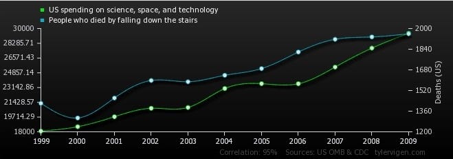
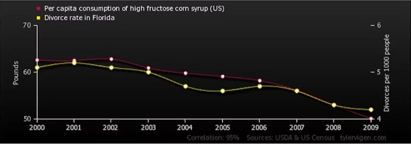
Sometimes, we see correlations that are clearly absurd:
The U.S. spending on science, space, and technology correlates with the number of people who fall down the stairs.
The divorce rate in Maine correlates with the consumption of high fructose corn syrup.
The number of civil engineering doctorates in the US correlates with the consumption of mozzarella cheese.
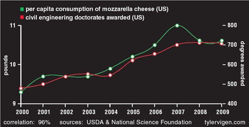
These examples humorously remind us that:
A high correlation can exist even when there’s no logical relationship at all.
Conclusion
In data, as in life, things often move together. But just because two variables walk side by side doesn’t mean they hold hands.
Covariance tells us how two things move, same direction or opposite.
Correlation tells us how tightly they move together and gives it a number we can work with.
But causation? Causation demands you cross the threshold from observation to explanation. It requires a why. Failing to distinguish between the two leads to false conclusions, flawed models, and bad business decisions.
Thanks for reading today’s issue.
If you’re here, you already think differently, like a statistician, not just an ML engineer.
You know that real progress starts with understanding your data, not just feeding it to a model.
Until next week’s issue, keep learning, keep building, and keep thinking statistically.
-Terezija